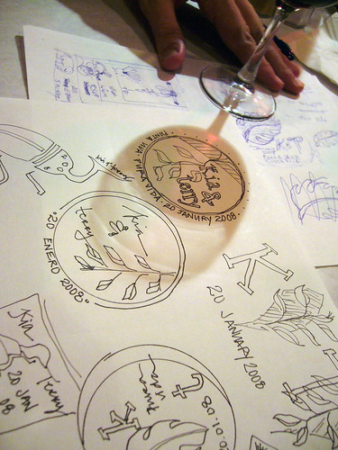
After much searching I found an icon. Then an online friend showed me how to restrict the image in a circle (thanks dani!) And off I went. This is the one we are going to see if we get made into an embosser. My fiance is not 100% about the font because his name looks like "Tezzy" and not "Terry". However it is the best font we could find so far thus it stays for now.
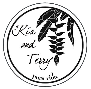 I also made one with our initials and the same heliconia icon.
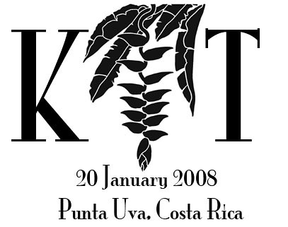 These are two other ones we will use in print and on our cyber sources, first with the four friends. It cracks me up. I couldn't find a peacock/pheasant and am using a penguin. Ha!
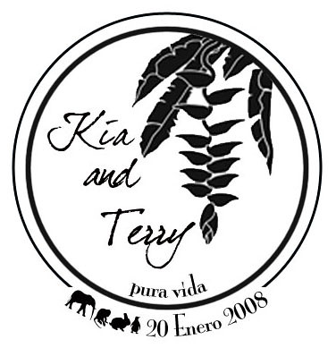 And here it is with no silly icons in the bordering space.
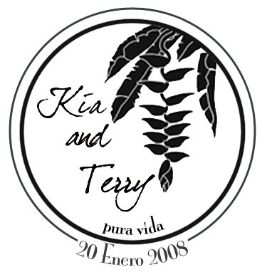 We didn't want colorful monograms and went for the classic black and white. They can be printed on bright stationary or laid over bright colors.
5 comments:
Kia those look incredible! I love the first one and the four friends one!
Those look fabulous.
I agree with Sarita.
Terry's name DOES look like Tezzy. ;)
That's great, Chzisty. How about you instead offer some constructive comment, like suggesting a better font! ;p
Christy,
I super <3 you right now. That last line cracked me up so hard! I cackled like a really old lady. We have already submitted one design for approval to the company making the embosser. Tezzy has through the weekend to find a better font. LOL!
i love it! and i think it looks like "terry".
Post a Comment